


UX Research
Good design is invisible right up until it isn't. The moment a user hesitates, second-guesses a button, or abandons a form, the interface has already failed them.
Design often gets treated as decoration applied after the product is built. That's backwards, and it's why the failure shows up in the numbers nobody wants to look at: drop-off rates, support tickets, abandoned carts. That's the problem NZMinds exists to solve.

How NZMinds designs interfaces people actually use
How NZMinds designs interfaces people actually use
32%
of customers walk away from a brand they love after just one bad experience. Source: PwC.

Understand real user behavior before deciding what the interface should look like.

Prioritize clarity and task completion over visual novelty.

Validate design decisions before they become expensive to change.

Use real usage data to improve the interface after it ships.
THE CAPACITY SOLUTION
.webp)

Best for: filling a specific skill gap on your existing team. Add individual experts to your existing team structure, managed by you.

Best for: a self-contained initiative that needs its own focused team. A fully formed team working exclusively on your roadmap, managed by NZMinds.

Best for: a cross-functional outcome, owned end to end, without the scale of a full center. Working hypothesis only, pending AD confirmation, do not publish until confirmed.

Best for: long-term scale across multiple ongoing initiatives. A long-term, dedicated extension of your engineering org, built for scale.
Our Services
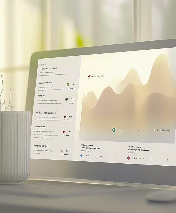
Interfaces built around clarity, not just visual polish.

Our expertise
Design decisions are grounded in how users actually behave, which means fewer expensive redesigns later.

Every screen is measured against whether it helps users finish what they came to do, which means higher conversion, not just prettier screens.

Reusable design systems keep your product consistent as new features ship, instead of drifting apart page by page.

Prototypes are validated with real users before development starts, which means fewer costly changes after the build begins.
Testimonials
“They didn't just build what we asked for. They pushed back on the parts that weren't worth building yet, and that saved us a quarter.”

Behind success
▶
“SaleUnio helped us scale with confidence and control. Processes matured, accountability tightened, and delivery accelerated.”
See how organizations like yours solved their capacity and capability constraints.
.jpg)
FINTECH SAAS PLATFORM · GLOBAL







20–35%
Average improvement
2–3x
Faster to the right engagement model
200+
Clients served
Customers walk away from a brand they love after just one bad experience. If the bottleneck is bandwidth, not design skill, that's fixable fast.
Need to scale quickly?→Resources






%20(1).png)